Following the announcement that Ultimate Gray and Illuminating yellow are going to be the ‘It’ colors of 2021, many fashion retailers have taken these results on board. Each year, Pantone picks the color of the year, which is usually a reflection of the sentiments left behind from the previous year, and the future of the one ahead. The underlying themes this year are optimism, reflection, and practicability: Illuminating Yellow and Ultimate Gray seem to encapsulate the air of 2021 perfectly.
Working with the results
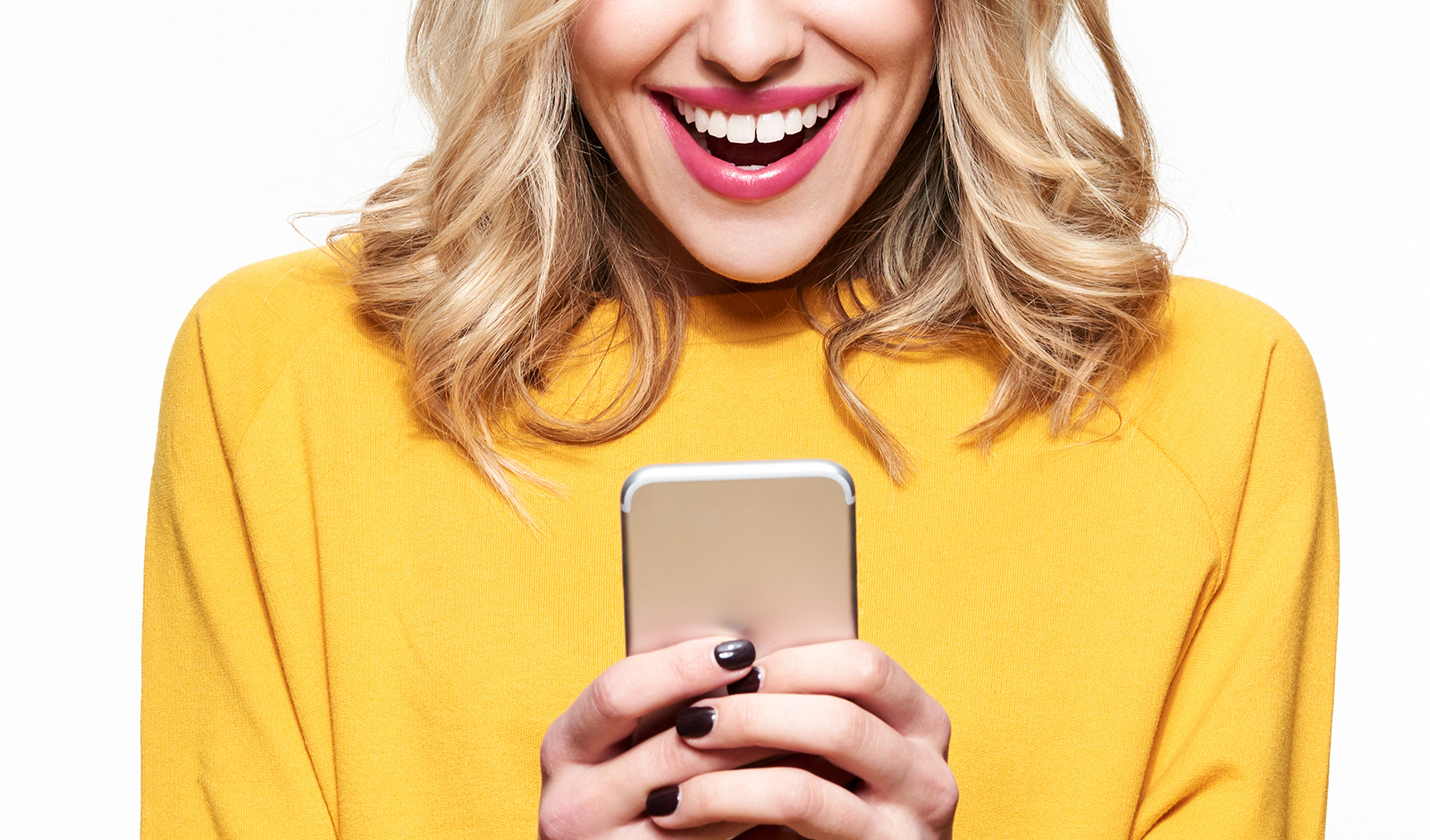
Most high-end fashion collections for Spring/Summer 2021 have rocked Ultimate Gray and Illuminating yellow. Versace’s affinity for hues of yellow is nothing new, and this year it is no different. The SS21 ready-to-wear collection has fully embraced the vibrant yellow shade, which can be seen in its abundance in a collection of brightly-colored pieces. Designers, such as Akris, Elie Saab, Dolce & Gabbana, and Prada, were also spotted showcasing the cheerful hue in their new collections.
On the other side of the spectrum are the fashion designers that chose to showcase the ever-reliable gray. Emporio Armani, Lupe Gajardo, Gauchere, and Balmain are just a few of the big names that created collections bolstered by gray tones. Moreover, the two winning colors have also been widely used in the pre-fall 2021 collections of Balenciaga, Salvatore Ferragamo, Moschino Donna, and Dior, as well as Max Mara, Jil Sander, and Oscar de la Renta.
The history of color
For those who are not familiar with Pantone, it is the institute that created the first color matching system, which all fashion and interior designers use as inspiration for their seasonal items. Each year, experts decide the colors that should set the tone for next year’s industry, based on various criteria and visions. This year’s choice, for example, drew inspiration from the events that happened throughout 2020.
The selection process involves a deep and thoughtful analysis of trends and socio-economic conditions. That is because many sectors across creative industries of all sorts – fashion, graphic design, home furnishing – use the results in their product development process. For the second time in 22 years, Pantone decided on two shades instead of just one, artistically illustrating just how unpredictable this year is most likely going to be. The first time this happened was in 2016 when Rose Quartz and Serenity blue were the decidedly dreamy colors of the year.
The importance of choice
Moreover, this is the first time that a shade of gray was chosen, and only the second time for a yellow. Ultimate Gray and Illuminating Yellow seem to be complete opposites, both in what they represent and in their intensity. Together they are supposed to send a message of positivity and optimism, supported by strength and fortitude. Ultimately, they represent people’s desire to see the bright light of hope at the end of the gray tunnel.
Although this seems like an unusual combination, it is proof that things are moving forward. High-end fashion brands have already embraced the colors of the year, which reflects onto individual habits and choices – from book covers and album artwork to the colors you paint your bedroom walls. In fashion, bright yellow handbags or accessories are chic and eye-catching, while gray gives you a great excuse to keep rocking your favorite pair of sweatpants, guilt-free. If you’re feeling adventurous, mix it with a lemon yellow coat and all eyes will be on you.